Liberty Grounds Coffee Co.
A warm, craft-first landing page for a Brooklyn neighbourhood coffee shop
Liberty Grounds had no web presence beyond a Google Maps pin. They needed a site that matched the warmth of their physical space — earthy tones, editorial typography, and a menu that felt as considered as the coffee itself — while driving foot traffic and contact inquiries.
I designed and built a single-page experience with six distinct sections: a full-bleed hero over a brick-wall café photo, an 'Our Story' about section with a bold image and three brand pillars, a tabbed interactive menu (Coffee & Espresso / Iced & Cold Brew / Bakery), a masonry photo gallery, a neighbourhood reviews block, and a contact & location section with an inline form. The dark-brown and warm-tan palette was pulled directly from the brand's existing signage and torch logo.
Site walkthrough
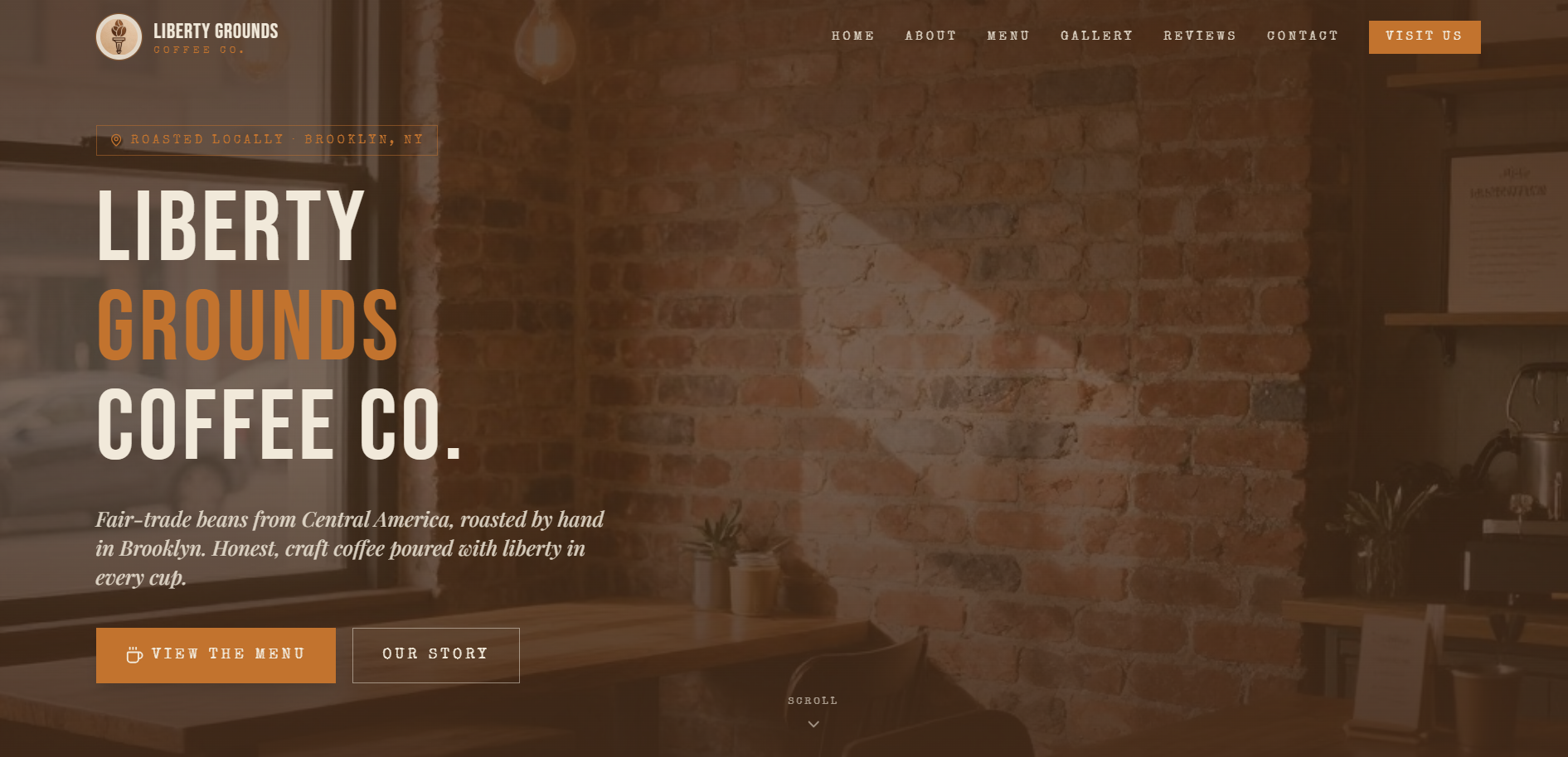
Hero — full-bleed brick wall photo with bold typographic headline
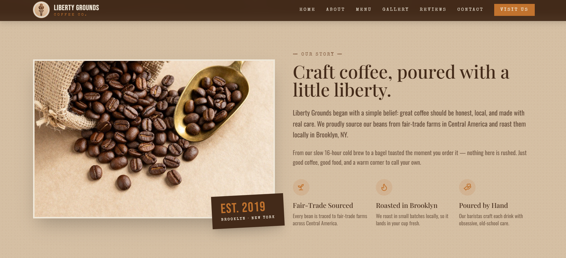
About — Our Story section with coffee bean photo and three brand pillars
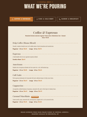
Menu — tabbed layout with Coffee & Espresso, Iced & Cold Brew, Bakery
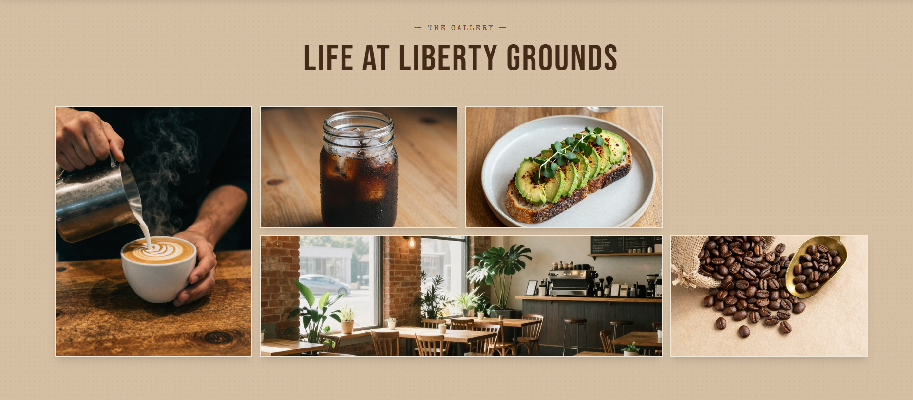
Gallery — bento grid of latte art, cold brew, avocado toast, and café interior
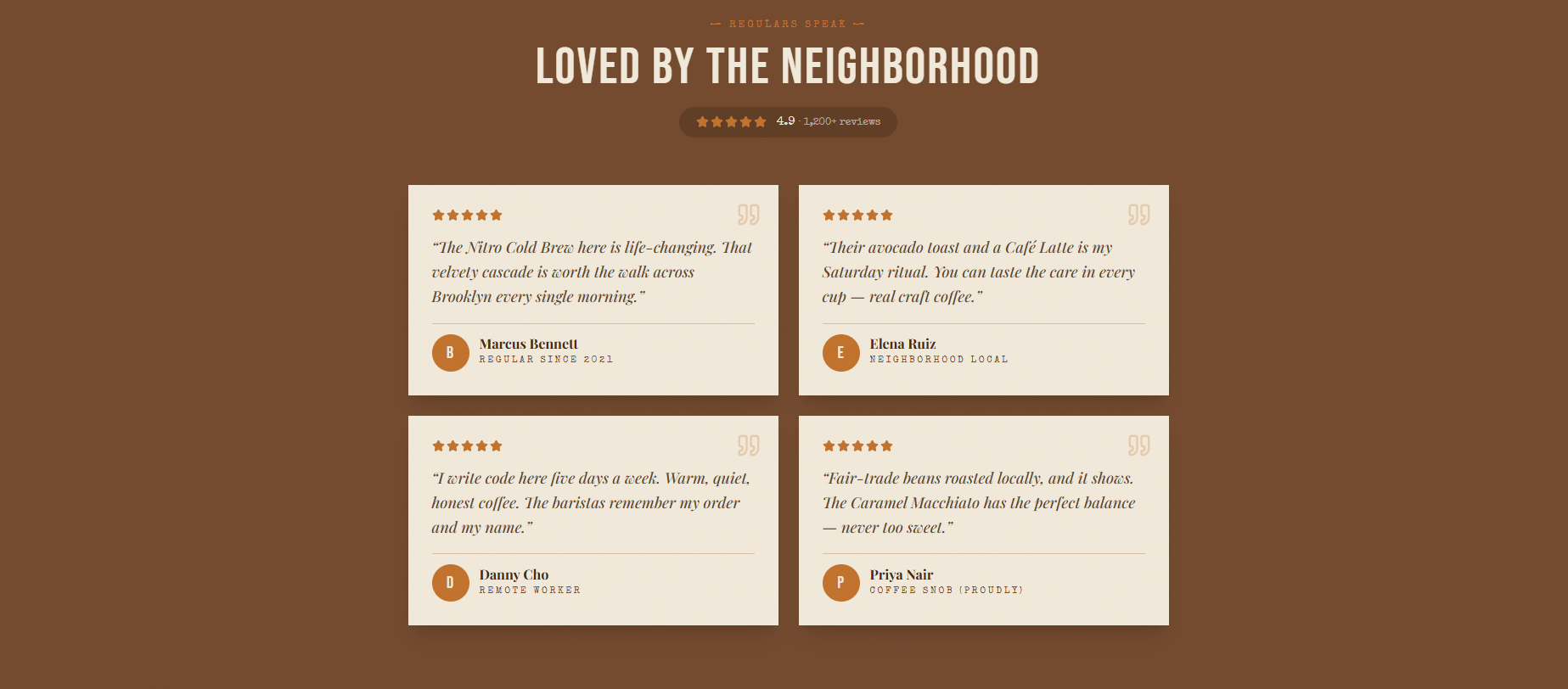
Reviews — 4 neighbourhood testimonials on dark-brown background, 4.9 stars
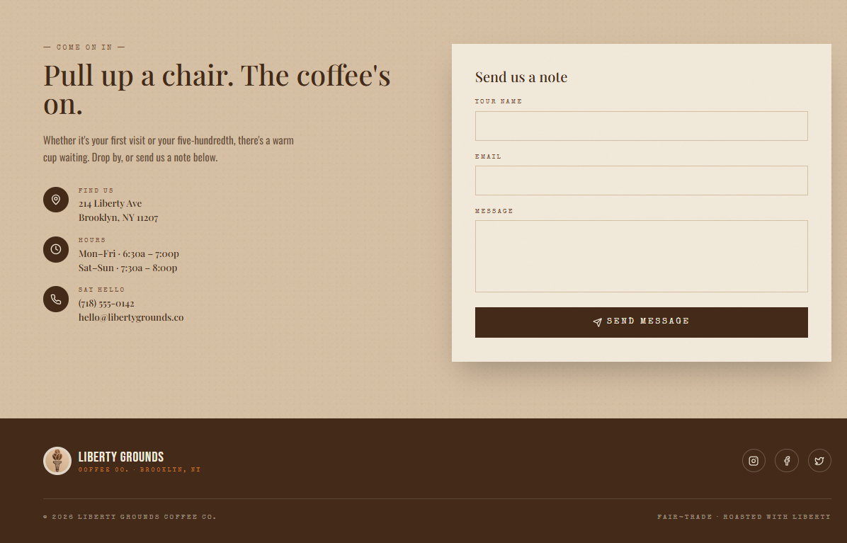
Contact & Footer — address, hours, phone, inline contact form